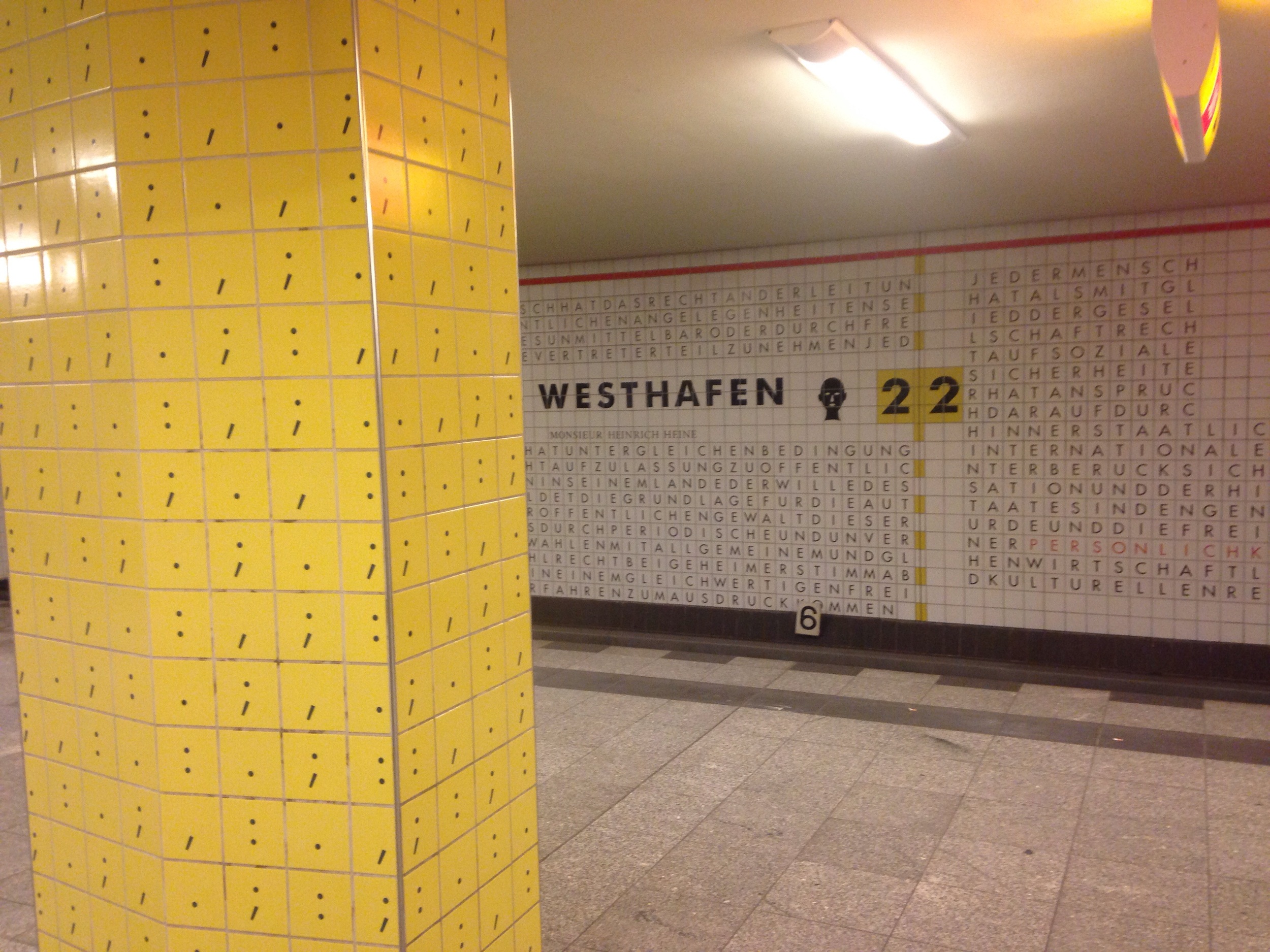
Lying at the northern border of Berlin’s Moabit district, just south of the Westhafenkanal on the U9 line, is U-Bahnhof Westhafen. In a city with so many strikingly varied train stations, Westhafen nonetheless stands as one of the most beautiful and unique: since 2000, the entire station has been home to a massive text-based art installation by artists Francoise Schein and Barbara Reiter, under the auspices of the multi-country Inscrire project.
Westhafen is one of 27 stops on the Ringbahn, which means it’s both a U-Bahn and S-Bahn station—but with the latter being a standard, ground-level outdoor station, the texts are limited just to the U-Bahn (i.e. underground) part of the complex and its connecting passages.

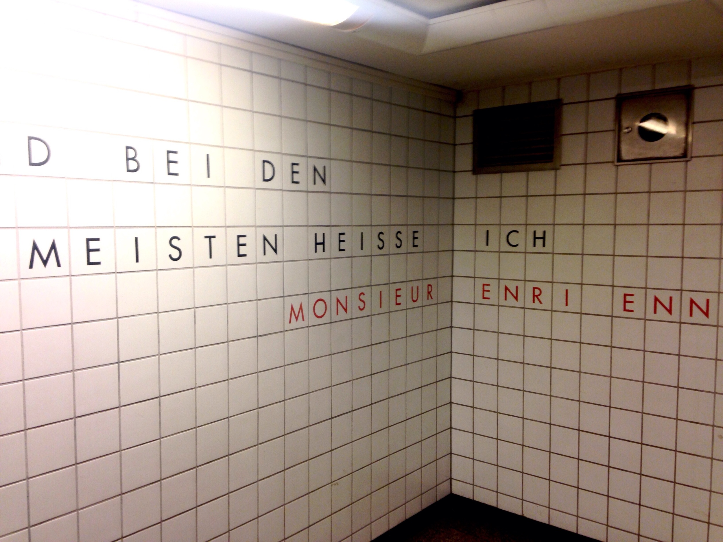
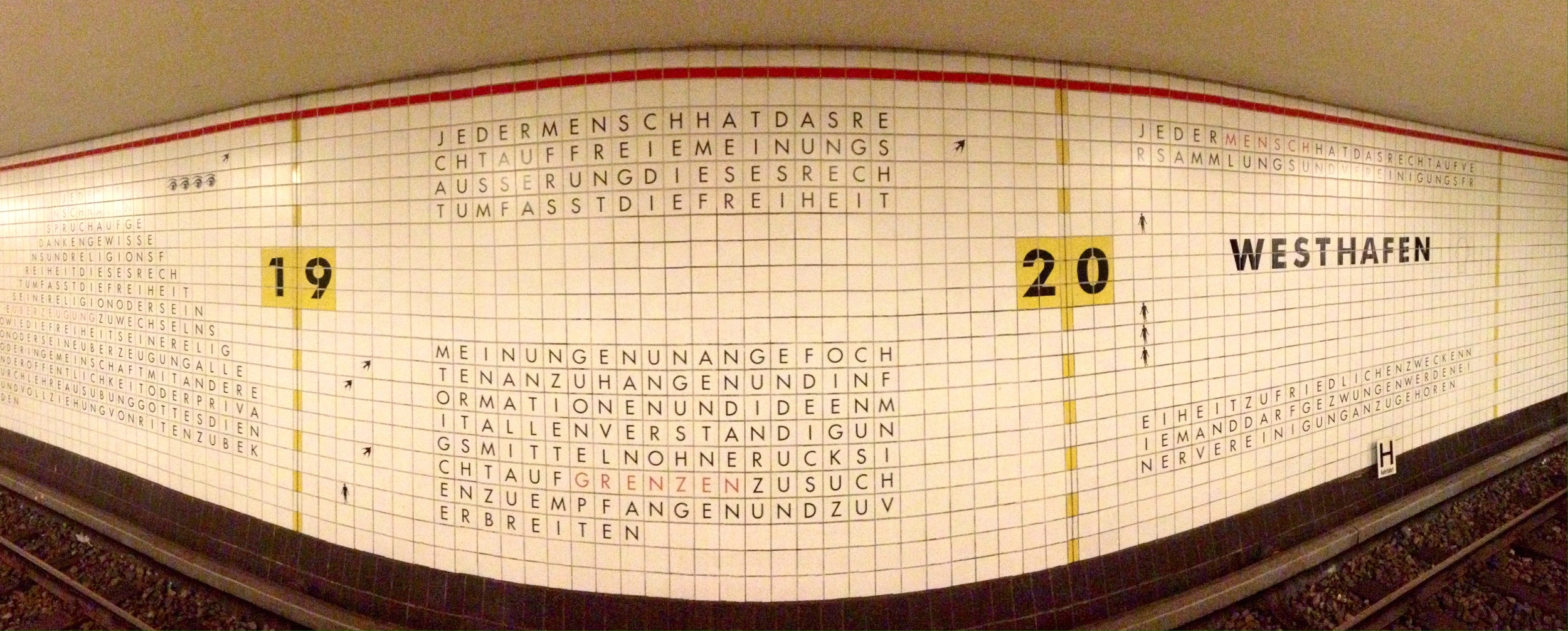
The text consists of all 30 articles of the Universal Declaration of Human Rights, bookended in the station-to-surface passages at either end with quotes from Heinrich Heine. It is laid out in a broad variety of geometric forms, using identically sized and spaced capital letters (with one letter per tile) as building blocks. The text on the outer walls has no punctuation, though it does include iconic representations of people and animals.
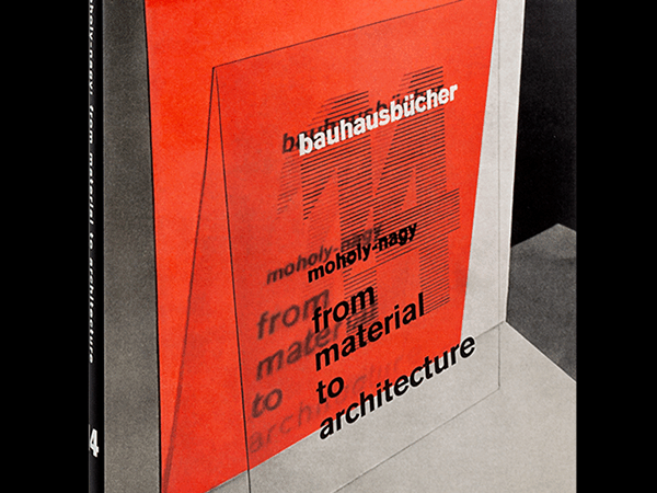
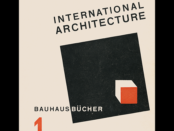
In fact, a great deal of the piece’s message lies in its design. The choice of Futura as a typeface goes beyond aesthetics: given that both Futura and its creator, Paul Renner, were exiled from Germany by the Nazis, it represents a homegrown German resistance to fascism like no other typeface. Beyond the letters themselves, the primary colors and basic, totemic shapes used strongly evoke the Bauhaus, an institution that was likewise shuttered by the Third Reich.
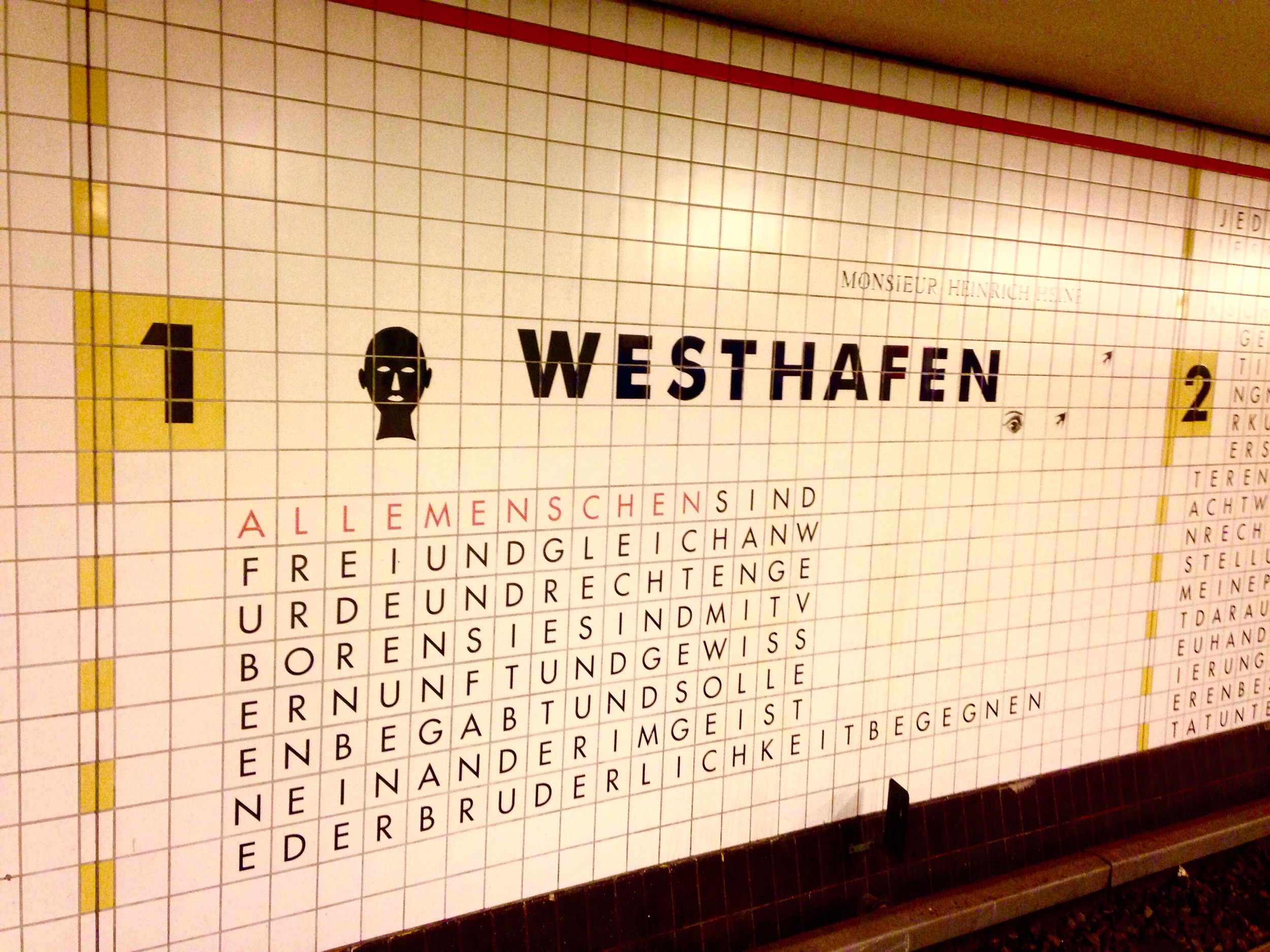
The lack of any punctuation within the text gives it the feel of a word-search game, particularly for non-native German speakers, who may need to take several runs at a passage before the blocks of letters break down into their respective words. Though the piece certainly has gravitas, there’s an unshakable sense of play throughout: even the quotes from Heinrich Heine (describing the negation of self-identity he felt in France, where his name was considered unpronounceable) have a playful, Oulipean spark, particularly in the variants of his name as it rolled off French tongues: “Enri Enn”, “Enrienne”, and even “Monsieur En Rien”.

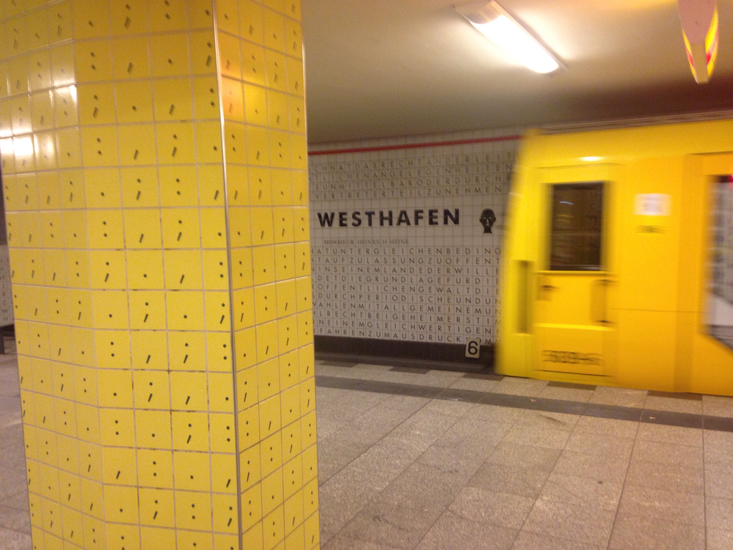
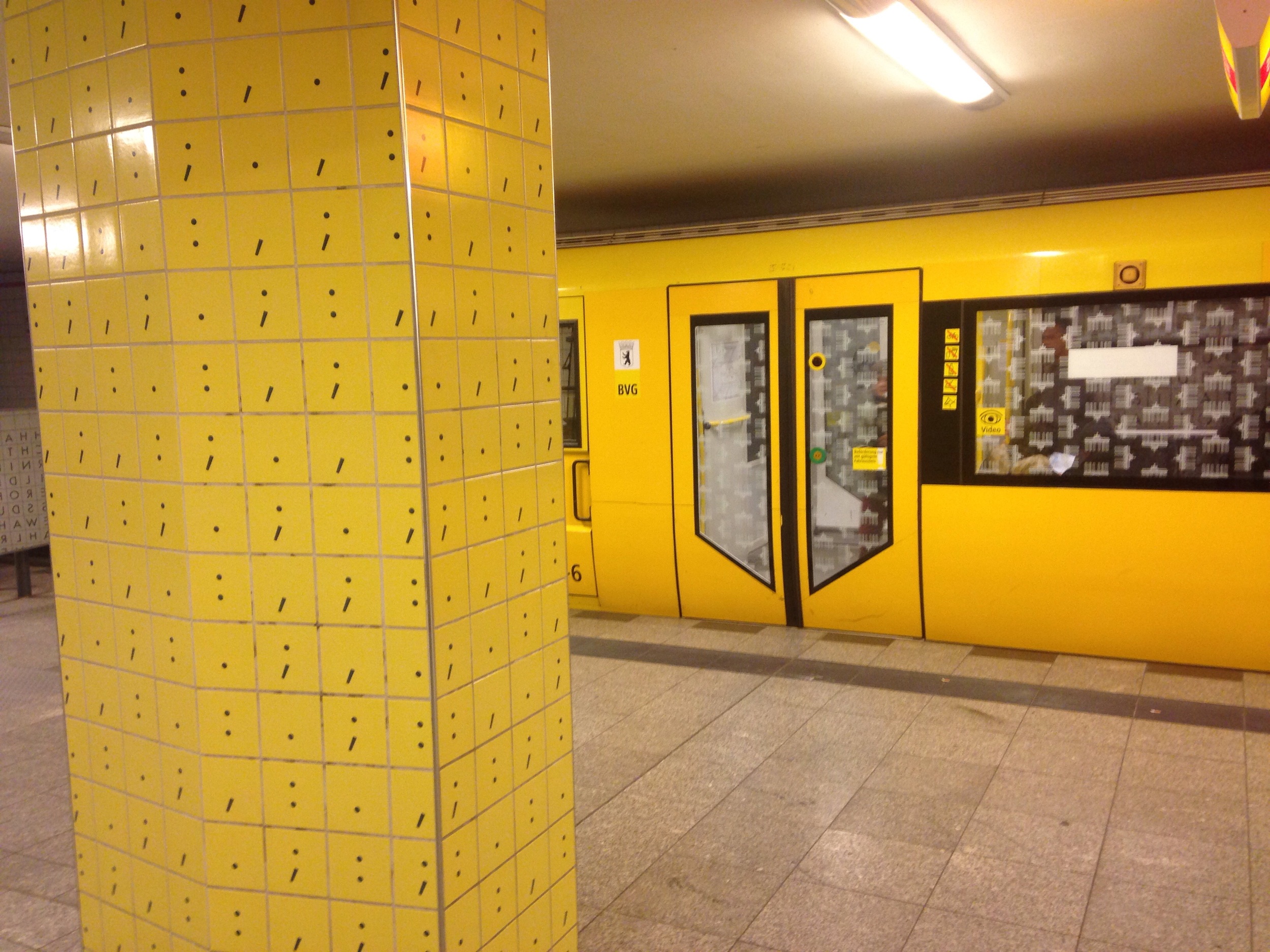
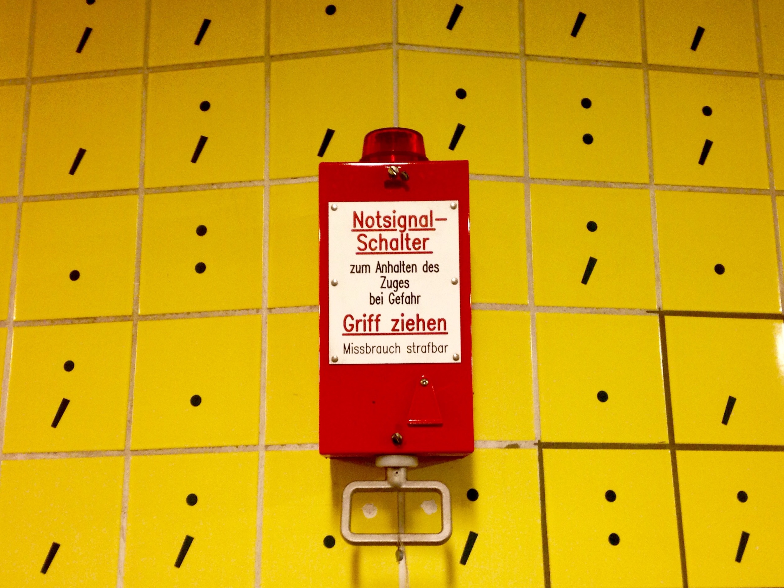
The platform’s central columns provide the final element of the piece, as well as tipping it slightly further in the direction of playfulness: they’re made up of bright-yellow tiles that contain all the punctuation missing from the outer walls. Removed from their natural environments and penned in their bright-yellow zoos, these isolated marks have a soundless, minimal beauty—not to mention that the color pairs nicely with the constantly arriving and departing trains.


Further info: Westhafen lies on the U9, S41, and S42 lines, and while navigating the immediate surroundings can be somewhat maze-like, they’re worth exploring: the station’s namesake, the nearby Behala Westhafen port, is worth a visit in its own right. Since the text runs left-to-right down both sides of the station, there’s not really a beginning or end to the installation, but entering from the S-Bahn tracks offers a good starting point.


